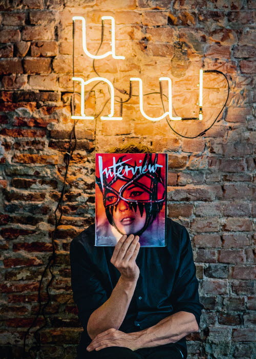
“What makes a good mag cover? When you wanna lick it or when it punches you in the face.”
Love comes in many different forms. In the case of multiple award-winning art director Jaap Biemans, a passion for magazines has become a career, as well as a lifetime obsession. Designing magazine covers is only half the current Jaap Biemans story, though. His passion for the subject also led to him starting up his own blog, Coverjunkie, that celebrates the art form from all corners of the world.
We got the opportunity to find out more about his ideas behind how to make a good magazine cover.
Always start with the story
“Storytelling is key for magazine designers," says Jaap Biemans. "Always start with the story, that’s the most important thing. Step two is trying to make connections, metaphors, visually striking approaches. Designing covers is an intuitive way of thinking, a way of observing and questioning the subject. Choosing to avoid or emphasise preconceptions. This creativity is king and perfect for magazines to stand out.”
Ability to capture the zeitgeist
Biemans’ covers have taken on iconic status, featuring a range that stretches from high art and topical issues to popular culture and sexual themes, earning the magazine a reputation for its ability to capture the zeitgeist. Biemans’ contribution has brought him increasing recognition and a raft of prestigious awards, including several SPD awards (NYC), D&AD awards (London), ADC awards (NYC) and “Best designed newspaper in the world” awarded by the Society of News Design (SND). However, he considers his Dutch Mercur d’Or award for his “entire oeuvre in design and contribution to the magazine community,” to be his best. He was even commissioned to design a few series of 10 postal stamps for PostNL in the Netherlands.

Inspiration from the classics
His list of achievements is testament to Biemans’ ability and hard work, but where does he draw his inspiration from? “There’s so much good stuff around,” he says. “Classics like The New York Times Magazine, New York Magazine, Zeit, Suddeutsche, The Guardian Saturday. I also buy a lot of vintage ones on Ebay. The ‘only’ subscription I currently have is Interview Magazine.”
An epic cover contains news, vibe and creativity
Biemans' site Coverjunkie has become wildly popular but it puts an ever-greater burden on his time (it’s still basically a one-man operation). Take a look at it and you can see why. With literally the whole world to choose from, how does Biemans go about deciding what makes the cut?
“What makes a good mag cover? When you wanna lick it or when it punches you in the face," he says. "It’s hard to provide a theory about this though. A magazine cover is all about temptation. A cover that rocks is one you can’t resist the temptation of picking up and reading. An epic cover contains news, vibe and creativity all in one. The covers everybody remembers are the ones featuring a war or a scandal. But Coverjunkie is not only about those covers; it’s about creativity in general.”
The text is an excerpt from article Cover Star, written by Geoff Mortimore, featured in PAPER #4. Images by: Jerome de Lint

